

Making Animal Welfare Feel More Hopeful and Approachable
2024
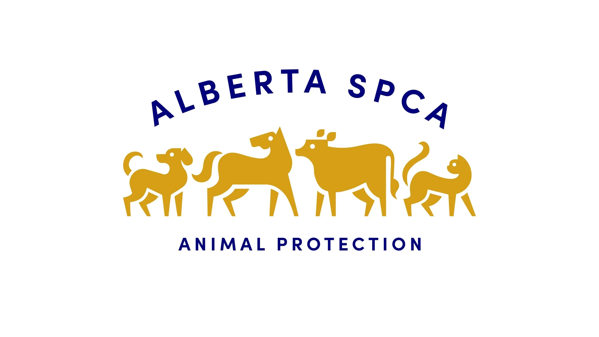
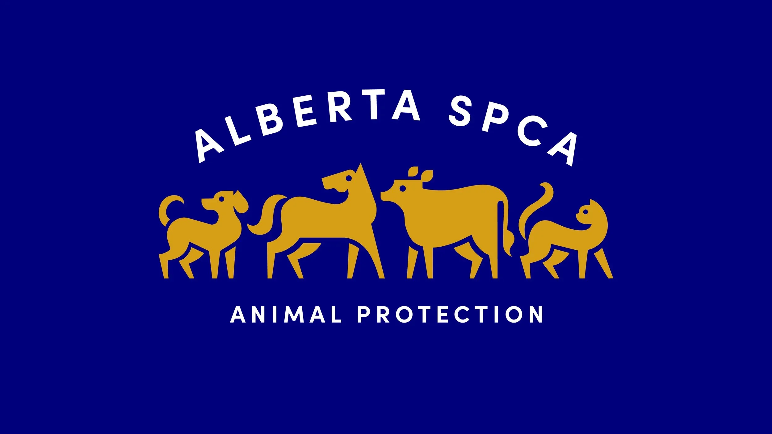
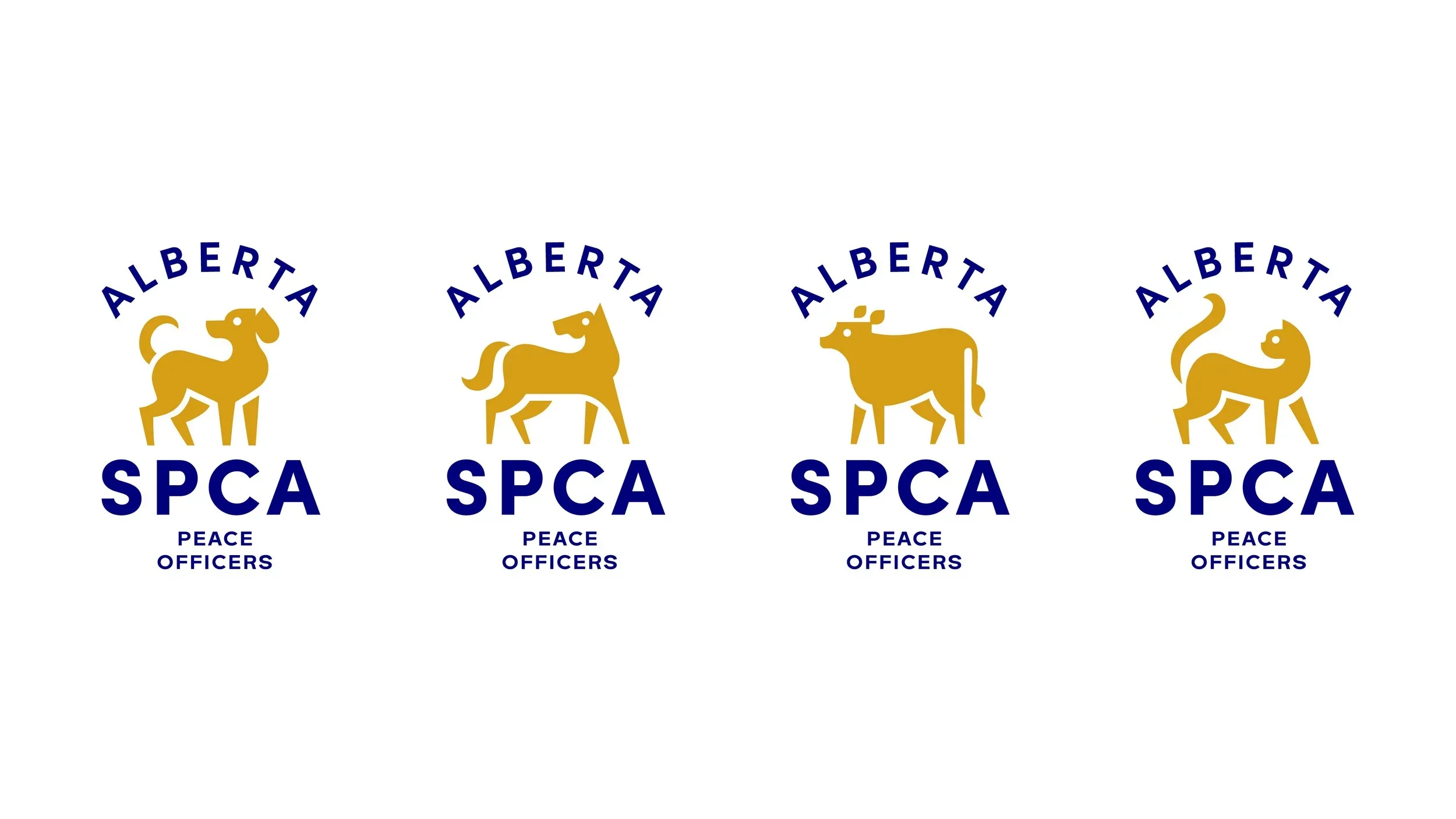
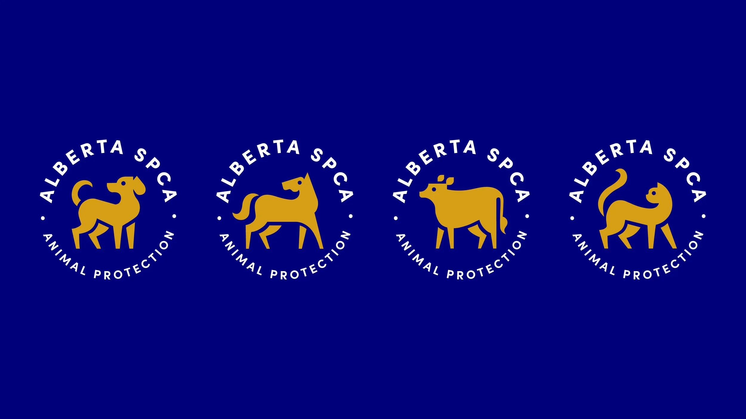
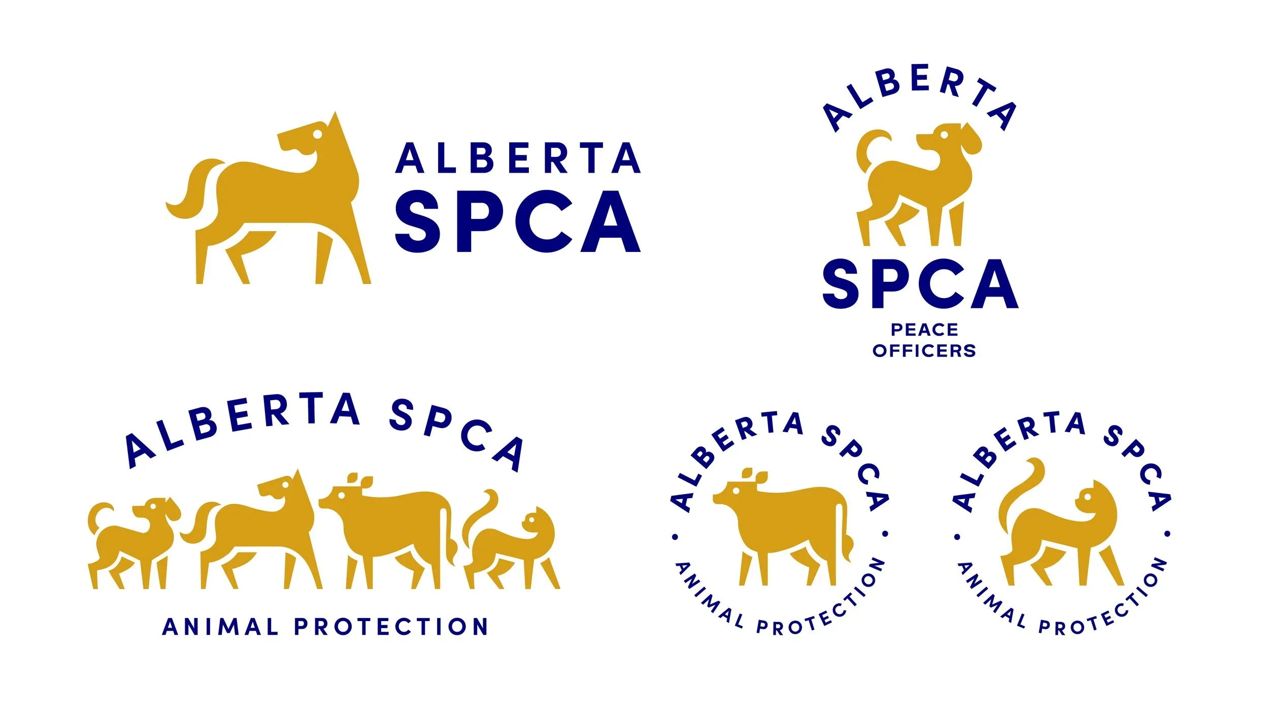
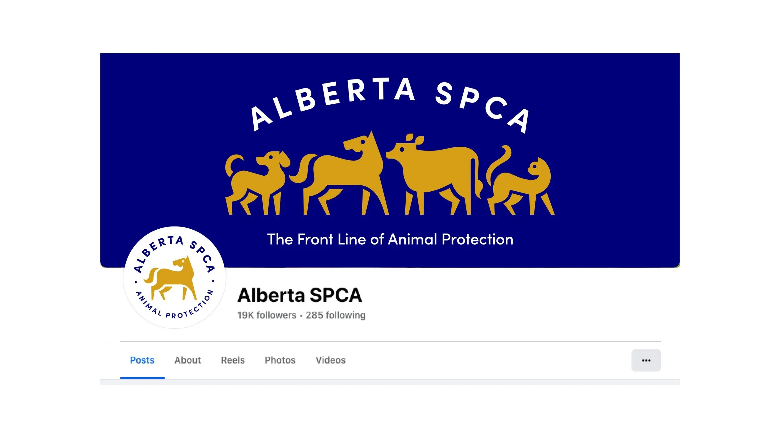
The Alberta SPCA needed a campaign that could connect with Albertans on an emotional level while encouraging support for animal welfare initiatives. By combining illustration, storytelling, and a more approachable visual style, the work helped communicate the organization's impact in a way that felt optimistic, human, and easy to engage with.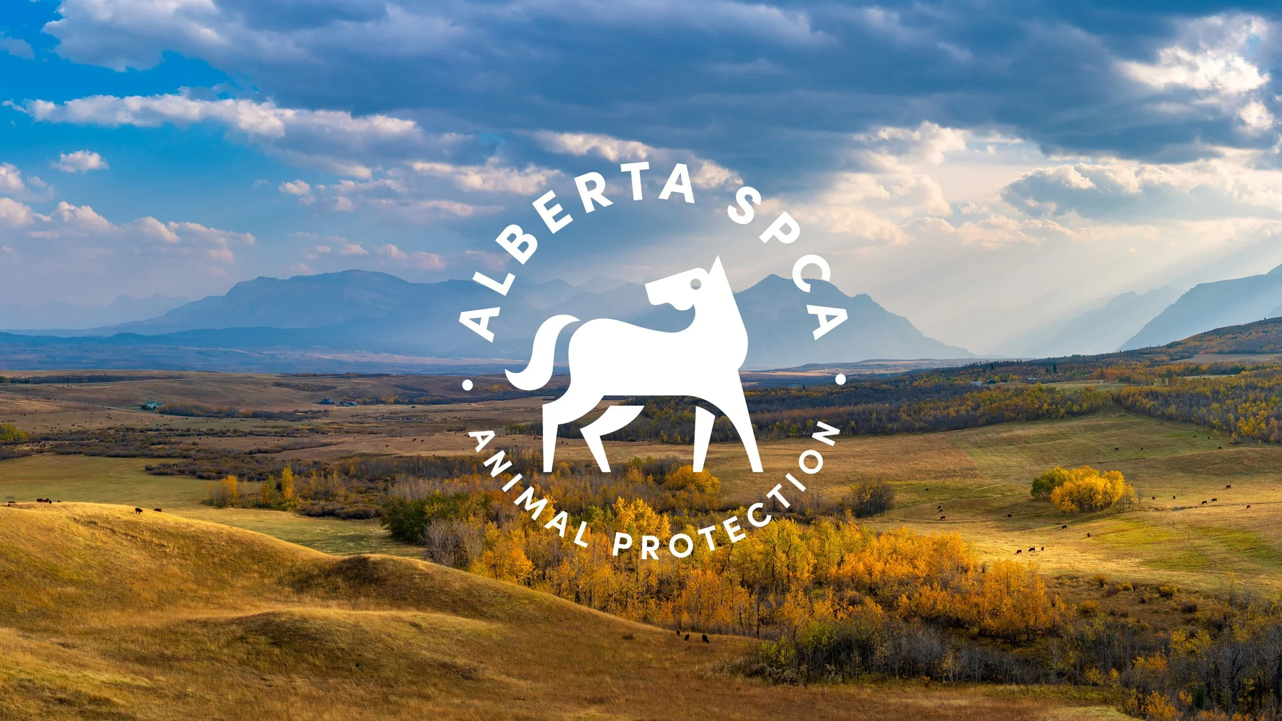

Built for Possibility
Create something you're proud of.
Whether you're just starting out or taking things to the next level, we have everything you need to connect, engage, and make something truly yours.